Friday, January 29, 2010

These are some of the examples I picked up to place on the typography wall. I thought they were great examples of both expressive and trendy typography that is out there today.

This white artifact is from Starbucks. There is no ink involved in the front of this gift card holder, it is however an embossed surface which displays the typography for the viewer.


I'D SAY THAT'S EXPERIMENTAL!!!!!


I found quite a bit of type treatments where the letterforms were created by other objects. Here is made up of flourishes. I also found type created from doves and dollar signs.

This type treatment of southern comfort was an approach that I saw in many pieces...even album covers. Some of those album covers are displayed below.

This set of album covers had a small trend where letterforms had a slant to a letter. The first 3 album covers have a slanted "A" whereas Metro Station has a slanted "M".

The trend between these six album cover is pretty self explanatory. (letter forms are built from multiple lines)


Finally, these were just some other great examples I thought that would display what trends or looks were being executed through the music industry.

INFORMATION ARCHITECTURE...FIND AND NOW SHARING!

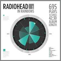
Below are some examples I found online designed by Mike Wirth and also a couple from GOOD. I thought these were great artifacts that have multiple depths of understanding each content. My favorite would have to be Flight Delays. I really liked how they used the well known "window from the window seat" shade as the measurement tool for displaying the city with the highest flight delays.


I think Flight Delays is an example of a representational diagram since it takes the form of airplane window seats.


Just another infograph.

Above is an example of a timeline based around the history of transportation.

I think The top 8 of 2008 CEO compensation is similar to a bar chart. It has similar form, but I guess it does reference a line chart also...so I'm not sure.


Some examples of pie charts.


I thought the one on the right was an interesting, very typographical way of displaying all the facts.


The image on the right is a series of coins designed to show the ratio of currency related to different countries.

seda.posterous.com/?tag=infographic
flickr.com/photos/rajkamalaich/3811689794/
www.yankodesign.com/.../

BASIC OUTLINE

Here is my basic outline from the readings so far. This will probably develop more as I start to see examples and tactics that reflect some of Vignelli's and McCoy's practices.


Thursday, January 28, 2010

BIL'AK + TRIGGS RESPONSE

I thought both readings were very intriguing in that of the explanation of "experiment" relating to typography. Bil'ak spoke thoroughly about the relativity the word experiment has to science and the process scientists usually go through. He stated that scientists begin with a hypothesis and go through trial and error until some amazing outcome surfaces. Triggs was different from Bil'ak and supplied many different examples of designers' views on the term experiment and what it meant in terms of design. One thing he touched on slightly that I noticed about the next step is the acceptance experimental typography has these days. With many active designers these days, it is encouraged to keep on experimenting and going through trial and error to see what works well and what doesn't. On the opposite side, he notices that the audiences are getting not necessarily smarter, but developing a more keen eye when it comes to advertisements and design in general. They have developed a different "way of seeing".

I would have to agree with David Carson's statement, "experimenting is something you haven't done before...or seen/heard by anyone" and Michael Worthington's "true experimentation means to take risks." My initial thought of the term was trying different things and using different sources and skills. (different avenues of communication, different mediums, different ways of communicating and persuasion) Possibly combining different skills to create a better, more successful outcome. My after thought now is that experiment is a lot of different answers. One must experiment to get those answers. Experiment can only be answered by the act of experimenting.

Through typography, there are endless possibilities as for what a headline/artifact can look like. That is where us as designers must experiment and go through the options available and in the end, find a solution that best benefits the artifact, client, and audience. Research is key, in some instances testing is good, and iterations...lots and lots of iterations.

Monday, January 25, 2010

Chalkboards!

Here are the first three boards of 2010! Board #1 has a ton of information...I think I'm going to simplify it next time, but it displays the benefits for Starbucks Card holders. Board #2 is the Daily Offerings board and what we are pretty much focusing on this promotion. (So Skinny Cinnamon Dolce Latte's, Skinny Vanilla Latte's, and Vanilla Rooibos Teas-all very low in calories if you're one of those people.) Board #3 deals with Starbucks VIA Ready Brew...coffee in an instant. Since it is our "on the go" coffee it's great for anywhere. Keep a look out for the next couple boards in a few weeks on the Plaza. Thanks!