Monday, November 30, 2009

Progress Report


Progress:
I shall begin with the titles. I have stuck with a universal title approach

Meet Justin - Mr. Perfectionist
Meet Marley - Little Miss Confused or Little Miss Clueless
Meet Duke - The Know It All
Meet Nick - The Weirdo

I have all of the copy for the books done, but still have to annotate 2 books.

TYPE3: PROGRESS AGAIN

I worked on assembling the rest of my pieces rather than getting stuck on the leave behind...which is where I think I did get stuck. Therefore, I've got a lot to get done still, but it's great working on things for our own representation. At the same though, it's really uncomfortable. Sometimes I wonder if I'm portraying and saying the right things...whether my design really reflects who I am. I know it reflects what I like...so I guess that's a start.


Monday, November 23, 2009

Winter Chalkboard Art

Board #1
This board has to be cohesive throughout all stores.


Board #2
We as a store have a little more freedom with this board. My manager wanted something representing Christmas Blend. Since it's the 25th Anniversary of Christmas Blend, I thought I would highlight that in some way.


Board #3
We have artistic freedom with this board as well. It was suggested highlight the pastries, so we can see rising sales within the pastry case.


VISLANG: OVER BREAK

Decisions I need to make, and problems I need to resolve:
1. The Cover - What will it look like? Is this going to be hand rendered? How will the text interact with the image? Is there a way I can crop the image to make a more dynamic cover? 10 different approaches
2. The Inner - Simple annotations on the first spreads/ Deeper explanations inside the flip down pages - How many pages are going to flip down? Which ones?
3. Binding - Figure out a solid way to bind the book
4. User Testing - Try this puppy out! See how people react to the folds and the information. Are the flip-downs too confusing? Are the persona's coming across the way I want them to?
5. Consistent dialog around the paper plate.

VISLANG: MORE PROCESS

I wasn't sure how to begin my annotations. Did I want them to be digital? Did I want them to be hand rendered? After working with the digital approach, I decided I didn't like where it was headed, so I explored the hand rendered route.


These are some of my annotation sketches as far as which style and look I want.

Below I printed my pages out and began annotating hoping I wouldn't misspell or mess up. I did once, but it's a matter of rewriting it somewhere else, and switching it in digitally.


Sunday, November 22, 2009

TYPE3: Leave Behind


Self promotional piece by Undoboy

Above is some visual inspiration as far as an idea for my leave behind. I thought about different aspects of my life and how they would look (designer, barista, pacific islander, bowler, brother, uncle, etc) After speaking with Dmitri, he had given me the idea to use type instead of images/illustration, so I went with that aspect, as I think there was more opportunity to create different messages. For the first round of iterations I decided to use one of the messages on my resume since it does have an interchanging factor about it. So the idea is these boxes would be able to mix and match with each of the different sides. I think a different typographical approach for each side would be great, therefore the viewer will not lose interest quickly. I also think the square nature of it compliments the square shape of my logo.

My thinking is the top box will house a USB(jump) drive with the portfolio presentation PDF and such.


I JUST THOUGHT....I think this might work better horizontally. After thinking about my mock-up and staring at it for a couple hours...it's a little wobbly because it is light, and if laid horizontally I think it would still be functional as far as being able to rotate and mix up the message. hmmmmm.


Friday, November 20, 2009

VISLANG: PROGRESS

Some visual inspiration.
Visually, I like the simplicity of design these pieces have. Although they are posters, I gives me a couple of examples of how I might go about designing my annotations.


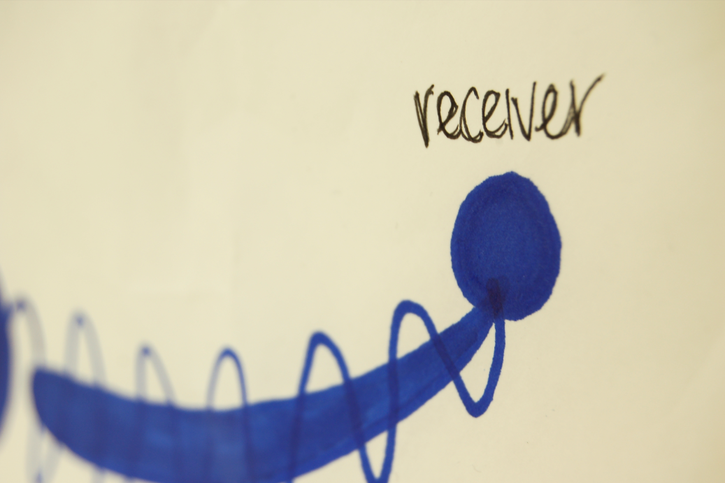
A different take on my communication model
Right now I'm trying to get the basis down, some other elements that are for sure going to be included are perception, reasoning, communication A & B, inputs, outputs, and processing.


My little books.
This is a little of what the basis is going to be as far as content. I have researched and based upon my research, I am deciding to create a persona, a little get to know I think will help.
So it begins like this.
"Meet Billy, the mumbler"
"Billy works as a gardner."
"He loves movies, and one day wants to be a critic for them."
"They are his real passion."
"Billy is a conservative guy, and usually keeps to himself."


These are my annotations on the right image. Instead of annotating every part of the conversation because it might be too repetitive, I am going to point out bits and pieces of the conversation. The communication model will be toward the end of the book after the conversation. Like a recap.


After playing around with the different folds, both up, down, and seperate, I have decided that it's better if I don't split the spread, and that it could work folding both up and down.


Analog annotations.