The Spring Break trip was awesome! Although I came to Kansas City from Colorado, I have to say that I saw things on this trip I have not seen before...and of course seen things I have. Below are just some images (of the many) that were pretty interesting.

This poster totem pole like thing was pretty interesting to see. This is where parties, lost dogs, and cheap jewelry sales are found!

Boulder Outlook was the first hotel we stayed at. It was a pretty cool place. Lot's of color, nice size pool, a hot tub, gym, and huge well...boulder to climb on.


Some interesting type treatment we've got going on...hmmm

This is one of many cool buildings that I saw out there.

This was interesting, but in a different way than the above building. It's windows are pushing out from the building!!

YES, THERE WERE
HERMAN MILLER CHAIRS IN EACH ROOM AT THE HILTON!


There were long bland hallways to walk down and think with crazy expressive carpet.

Cool room number pieces

Neutrogena sponsored :)

Some paint job

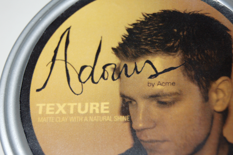
Stylized typography

Gotta love those puns!

and some random trucker transporting what looks to be "horses".